How can we make mental healthcare more accessible?
VENT: Virtual Support Groups | IOS Mobile App | Product Designer
VENT: Virtual Support Groups | IOS Mobile App
The Problem / My Role
The Problem
Therapy, one of the most effective modalities for treating mental health conditions, remains inaccessible to most because of a few limiting factors:
Therapy is expensive (in 2020, the average therapy session cost $80)
Limited pool of practitioners (finding a therapist that accepts one’s insurance can last an average of three months)
My Role : Product Designer
A Twitter thread detailing the struggles of many individuals in finding affordable mental healthcare.
Objectives/ Constraints
Objective
It was necessary to formulate concrete research objectives to understand user pain points and devise solutions.
To do this, I chose to identify potential users of this app and interview them in hopes of answering key objective questions.
Constraints
To remain competitive with existing products, the platform was designed as an IOS native app
The product would have to be free/low cost
Objective Questions:
1) What are the factors preventing someone from seeking out mental health care?
2) What are some of the reasons people stop going to therapy?
3) What alternatives to therapy do people engage in to improve mental well-being?
4) What is the standard process of finding a suitable mental health care provider?
Step 1:
Competitive Analysis
Online therapy is often regarded as the most accessible form of mental healthcare.
It was paramount to identify needs in the user base that aren’t being met in current mental health apps. A heuristic analysis of these app would give me an idea of what’s available.
Step 1:
Competitive Analysis
Online therapy is often regarded as the most accessible form of mental healthcare.
It was paramount to identify needs in the user base that aren’t being met in current mental health apps. A heuristic analysis of these app would give me an idea of what’s available.
I harvested an abundance of data from hours of interviews. It was overwhelming to say the least! I knew that in order to draw relevant insights I would have to organize my notes by grouping ideas based on category and association. I did this using an affinity mapping technique.
Just knowing that what I'm feeling is normal and that there are people who feel that way right now.
I did a final pass. By now trends began to emerge. I Subdivided further into specific categories. I was left with the following:
Benefits/Challenges of Isolation
Remote Work
General Isolation
What we miss - Pre-pandemic
Strategies to Relieve Effects of Isolation
Basic Human Needs
Tools/Habits/Practices
Mindset
Apps
Therapy
CLICK TO VIEW IN MIRO
4TH ROUND
Key Insights
I was able to distill the results from the mapping exercise into 5 key insights.
At this point I knew that the success of this platform hinged upon:
Building a safe environment for people to express themselves vulnerably to others.
Find other users going through similar struggles.
Insights
1. Lack of structure / accountability lead to a lack of direction/control over a user’s life.
2. Lack of vulnerability / intimacy lead to lack of meaningful interactions in a user’s life.
3. Lack of meaning / isolation for users lead to mental health decline and low self-esteem.
4. Users take comfort in knowing they are not alone in their struggles.
5. Therapists are hard to find,costly, and not sustainable long termfor most users.
Step 4:
Empathizing with the User
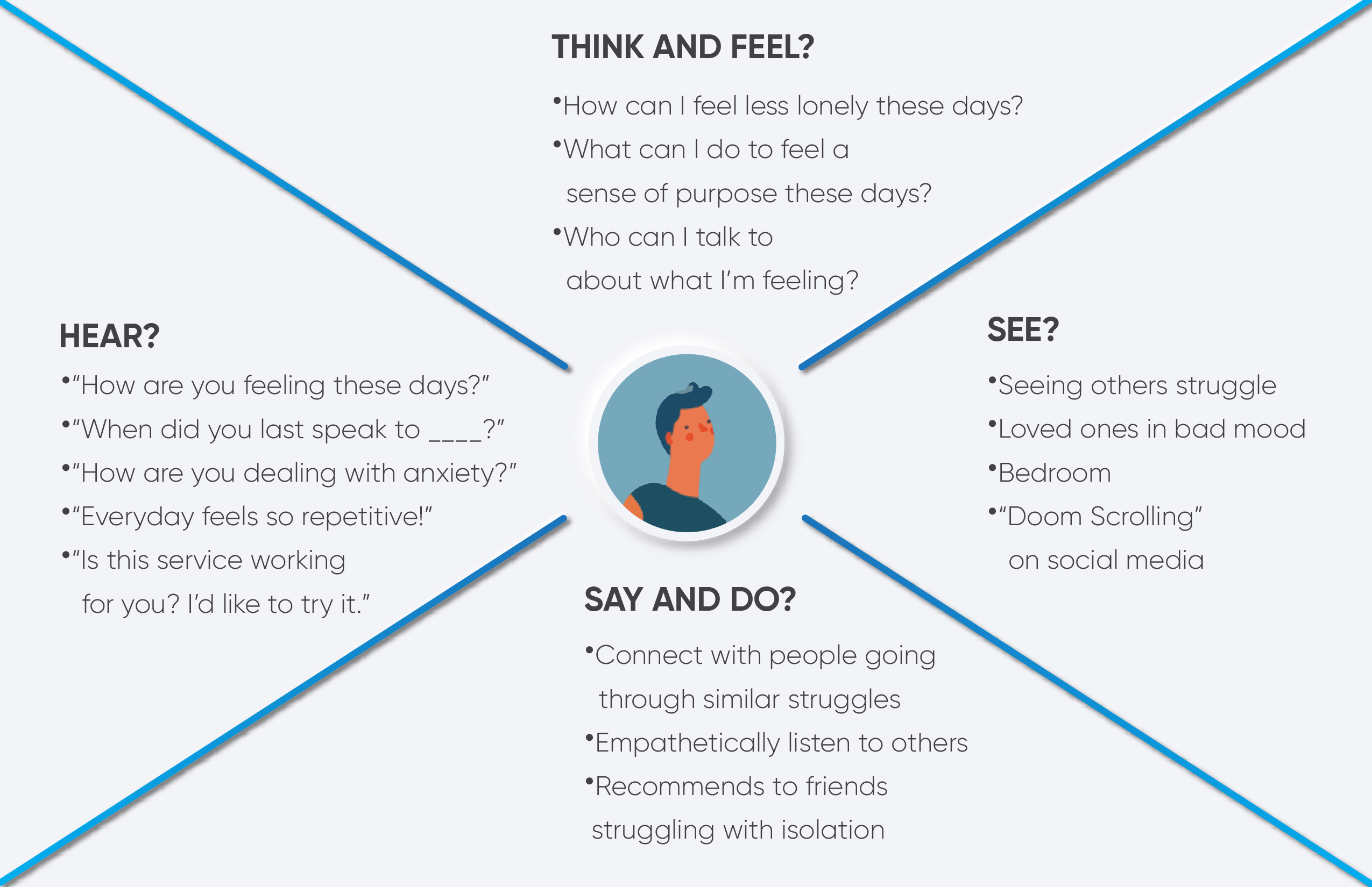
It was imperative to identify what potential users may be experiencing day-to-day in the grips of an isolating pandemic. I organized my insights and observations into empathy maps in order to better understand their pain points, feelings, goals, thoughts and behaviors.
The first type of user I identified has a few pain points, desires, and goals:
The pandemic has limited their interactions with friends/ family
This user wants to be able to vent to willing listeners
This user wishes to not burden friends with their problems
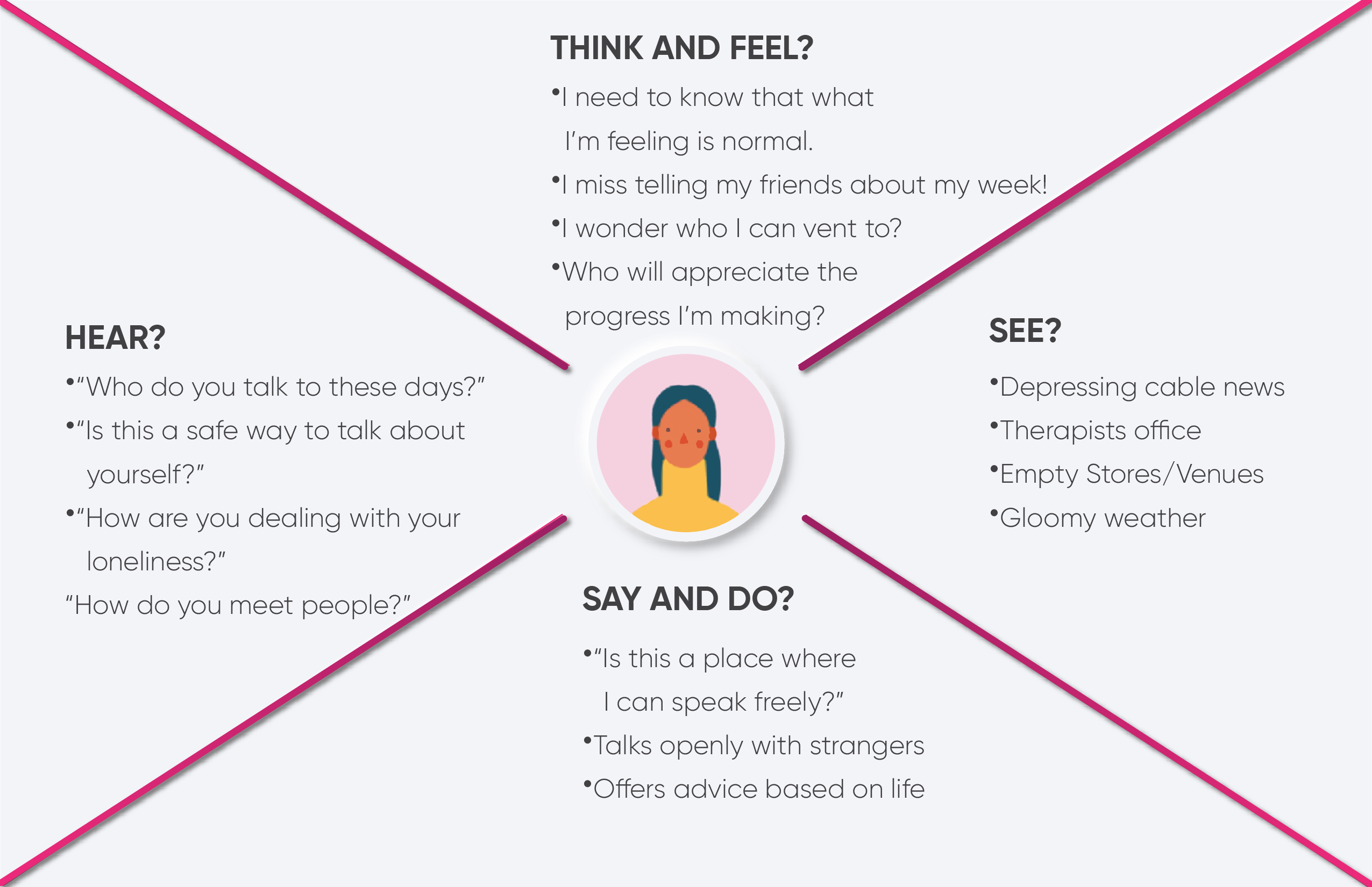
Similarly, the second type of user is looking for:
• An outlet to speak to others in an affordable and flexible way.
• To help others who are struggling.
• To meet others going similar struggles.
Step 4:
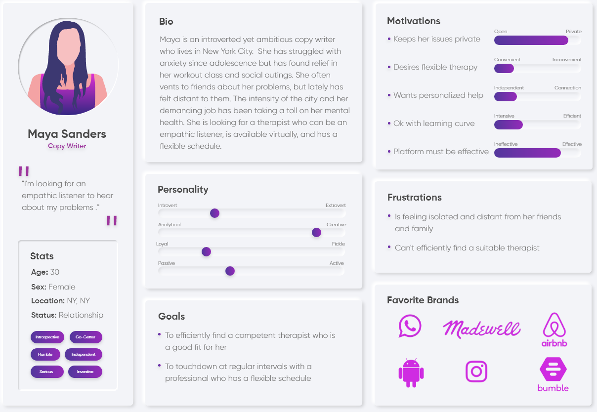
Who are our Users? (Personas)
Because empathy maps can be abstract, I found it helpful to map user pain points onto personas.
Maya represents half of the users I interviewed; an ambitious female who is career-oriented and struggles with anxiety. Maya:
Vents to her friends regularly
Often feels isolated
Wants flexible/efficient therapy
Alec represents the other half of the users I interviewed. He works a bartending job and often gets home very late. His demands he work atypical hours and his income is precarious. Alec:
Lacks people in his life to share his struggles with
Does not make enough money for formal therapy
Offer help to others in any way he can
Step 5:
How Might We....?
Upon knowing what the target users were looking for, I reframed the core issues as “How Might We…” statements to get an idea what problem we were designing for. Both Alec and Maya are looking for:
• Cheap, community-driven, flexible form of therapy.
• Therapy they can revisit on a regular basis.
• A means to communicate with peers who they can relate to.
Therefore, how might we:
1. Make therapy more accessible and sustainable long term?
2. Foster safe, intimate, and vulnerable conversations between struggling individuals?
Step 6:
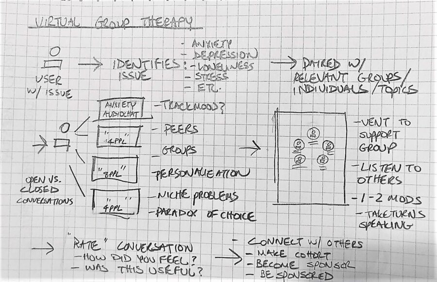
Ideation
An early diagrammatic sketch that I explored was a platform for online group therapy
01
Personas/ HMW
First, I kept in mind the "How Might We..?" statements and Alec/Maya's pain points/ desires.
02
Iterate
Then I sketched out several iterations. It was important to explore multiple solutions and weigh the pros and cons of each.
03
Explore Idea
After weighing several potential solutions including:
• Curated, one on one conversations
• Self-Guided Therapy
I committed to exploring virtual group therapy. Group therapy accomplishes two things:
1) For the patient, it significantly decreases the cost per session
2) It gives users a support system of individuals going through similar struggles, encouraging progress.
Step 7:
User Stories
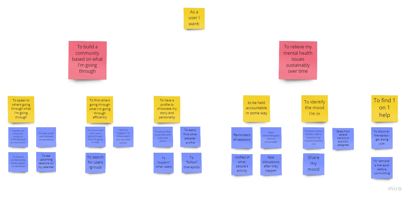
A collection of user stories based on the pain points and desires of Alec and Maya
With the solution in hand, I composed several user stories, by asking myself, “As Maya/Alec I want to do [goal] so I can achieve [outcome].
This exercise, helped me formulate essential features of the MVP:
∙ Ability to identify one’s mood
∙ Support Group pages
∙ A feed of group discussions
∙ Calendar of upcoming sessions
∙ Chatting with peers
∙ Custom user profiles
Step 8:
Information Architecture
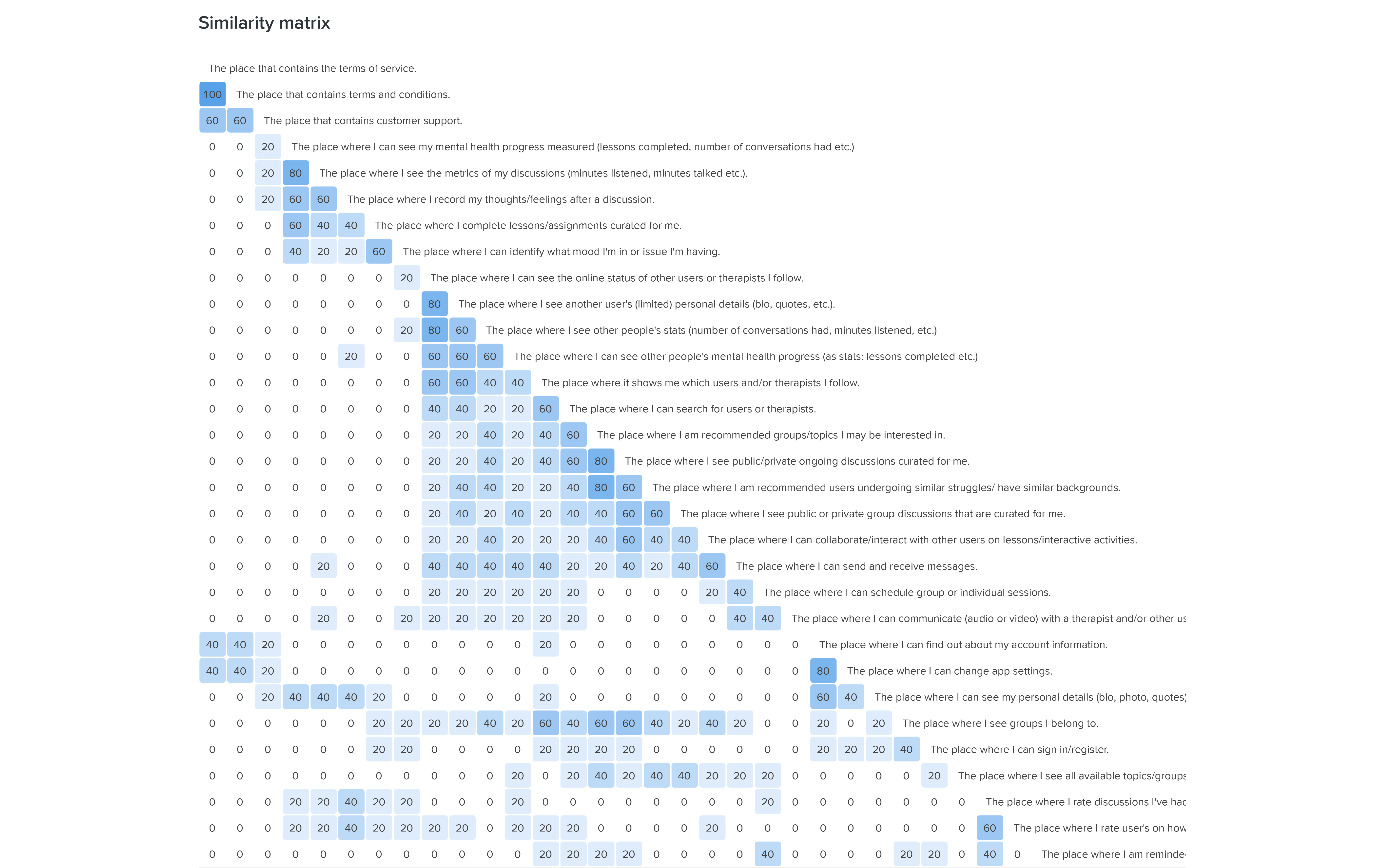
I used a card sorting exercise to allow users to identify the structure of the app’s navigation. The purpose of this card sort was for users to group the cards by similarity to ensure an intuitive navigation. The activity was done remotely using Optimal Sort.
A Similarity Matrix shows the proportion of the participants who grouped any two cards in the same category.
There were a total of 31 cards that covered the areas of profile, audio call, chat, calendar, and settings. The results of the card sort varied.
There was consensus around sections such as ‘settings and ‘accounts’, but variability for sections such as:
The area where “groups have discussions”
“Where one can schedule a session”.
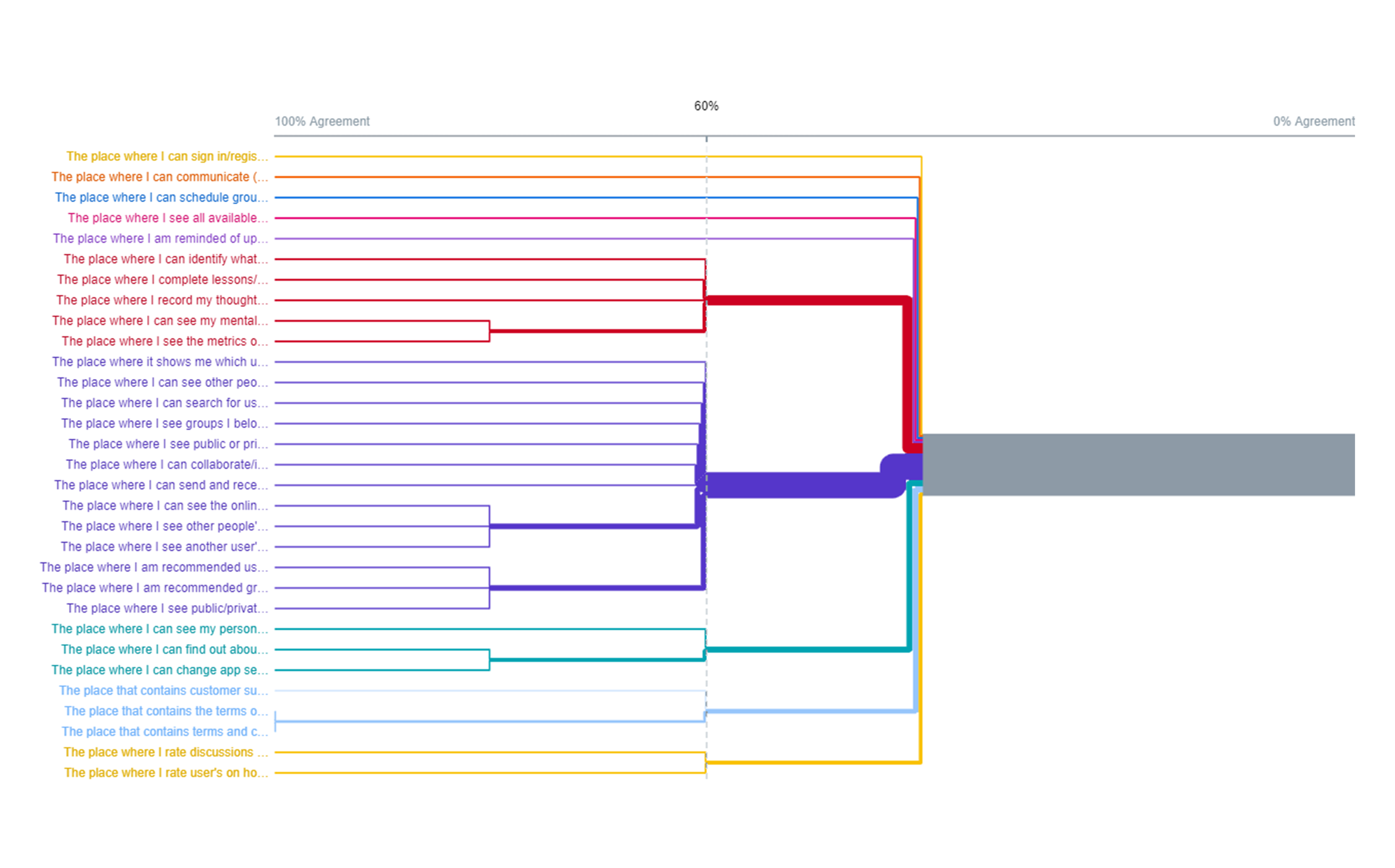
A Dendrogram that shows what proportion of the participants agreed with particular card groupings.
Step 8:
Site Map
The card sorting exercise gave me valuable insight into the mental models of my users and how they envisioned the architecture of this app. The navigation was ultimately categorized into: “Community” (a feed), “Notifications”, Discover (search), “Profile”, and “Home”.
A site map is a diagram of a site’s navigational hierarchy. It helps keep track of all screens while detailing their relationship to one another.
There was a lack of consensus around certain features that proved to be a sticking point. These were:
Where one finds all available support groups
Where one communicates with other users or therapists
Upon collecting sufficient data, I laid out a detailed site map to guide the architecture of this app. Though it was a good start, I found myself iterating on the site map multiple times throughout the design.
Step 8:
User Flows
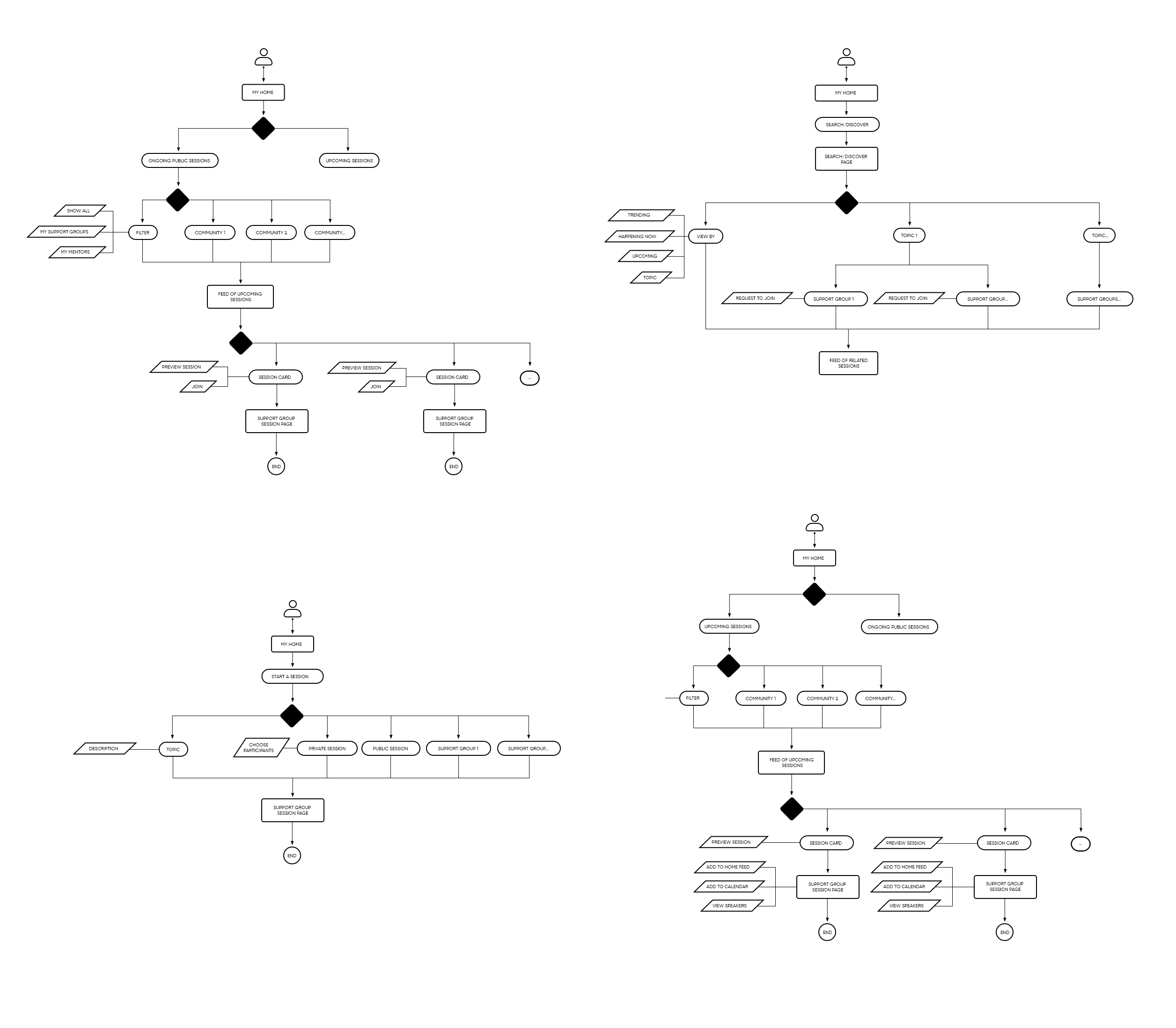
A user flow is a useful visual representation of a specific route that a user might take through a site or app to achieve a goal.
It was imperative for me to consider all the ways users could navigate through this app. Studying how users join group therapy sessions, and find support groups, forced me to consider how “sessions” and “support groups” relate to one another.
User Flow 1: Joining a Group Therapy Session/View Upcoming Sessions
Scenario 1: Users arrive at home screen and want to join a session
Scenario 2: Users want to join a session based on a particular topic.
Scenario 3: Users wish to search for upcoming sessions
User Flow 2: Finding a support group/requesting to join
Scenario 1: Users want to find a list of all available support groups.
Scenario 2: Users want to request to join a support group
User Flow 3: Creating a Session / Post
Scenario 1: Users want to initiate a public group therapy session.
Scenario 2: Users want to initiate a private group therapy session.
Scenario 3: Users want to schedule a group therapy session for later.
User Flow 4: Find Practitioner/Request a Session
Scenario 1: Users want to find a mental health practitioner via search/ available support groups.
Scenario 2: Users want to request a session from a particular practitioner.
Step 9:
Sketches
With the user flows in hand, I started to sketch before diving into wire-framing. The core function of the app is to join sessions and find/ join support groups. I knew the success of these features hinged upon being apparent and intuitive.
The home screen presents you with a feed of curated group therapy sessions via cards.
I chose to have a prominent floating action button to initiate a new therapy session. I also explored what a group session could look like; would it be audio-only calls or video calls?
Sketches helped me explore ideas quickly without committing to detail.
Step 10:
Wireframes / Prototypes
I decided to A/B test two similar designs: One with a carousel of support group pages linked on the home screen, and the other with a slide out menu containing these links.
Step 10:
Prototype A
The homes screen of Scheme A proved to be too busy to be intuitive.
In Scheme A:
The support group pages are linked on a carousel at the top of the screen
The navigation bar funnels the user to either the posts, lessons, sessions, or upcoming, (calendar) feed.
To create a session, the user taps a button on the bottom nav bar
User testing revealed:
It was not clear what the carousel was for
The word “discover” was vague
Users struggled to create a new therapy session
Step 10:
Prototype B
In Scheme B, the home feed was more legible and intuitive but the list of support groups was difficult to find for users.
Scheme B hid the support group menu into a slide-out menu. Users could access this menu by tapping the floating action button.
In Scheme B:
User’s struggled to located the support group slide-out menu.
People defaulted to the search bar to locate support groups.
Users confused the words “Groups” (support groups) and “session” (audio call therapy session).
Step 10:
Wireframes and Prototypes
The final set of wireframes before moving onto high-fidelity mock-ups.
User testing revealed Scheme B was more successful. However, user’s still struggled to find the support groups they were a member of, and had trouble creating their own session. To address these I decided to:
Remove the floating action button / slide out menu
Merge the list of support groups and the “discover” page into one tab called “Groups”
Label the “Create a session” button
Step 11:
Design System
Users expressed early on that each support group page have their own theme. Anticipating the heavy use of color, it was imperative to ensure the supporting UI elements were clean and did not overwhelm the content.
After testing dozens of color schemes, I concluded that the colors used for each support group page should be contained within one hue. The goal was to designate one hue per group page.
Cerulean Blue was used for the CTA’s because it has been shown to successfully grab attention.
To maximize legibility, I selected a simple yet striking sans-serif font, TT Commons, and used variations of it for everything from headings to labels.
The UI is largely built upon a series of cards, chips, avatars, and buttons.
Group therapy sessions are summarized on cards with relevant details like time, topic, moderators, and users.
Step 12:
High Fidelity Mock-Ups
After the first couple rounds of user testing, I was ready to implement the aforementioned changes to the architecture of this app. With the design system in hand, I set out to produce the high-fidelity mock-ups. I knew another round of testing would lend a clearer picture of what works and what doesn’t.
Flow 1:
Joining / Rating a Session
(Video) Find and Join Session Flow
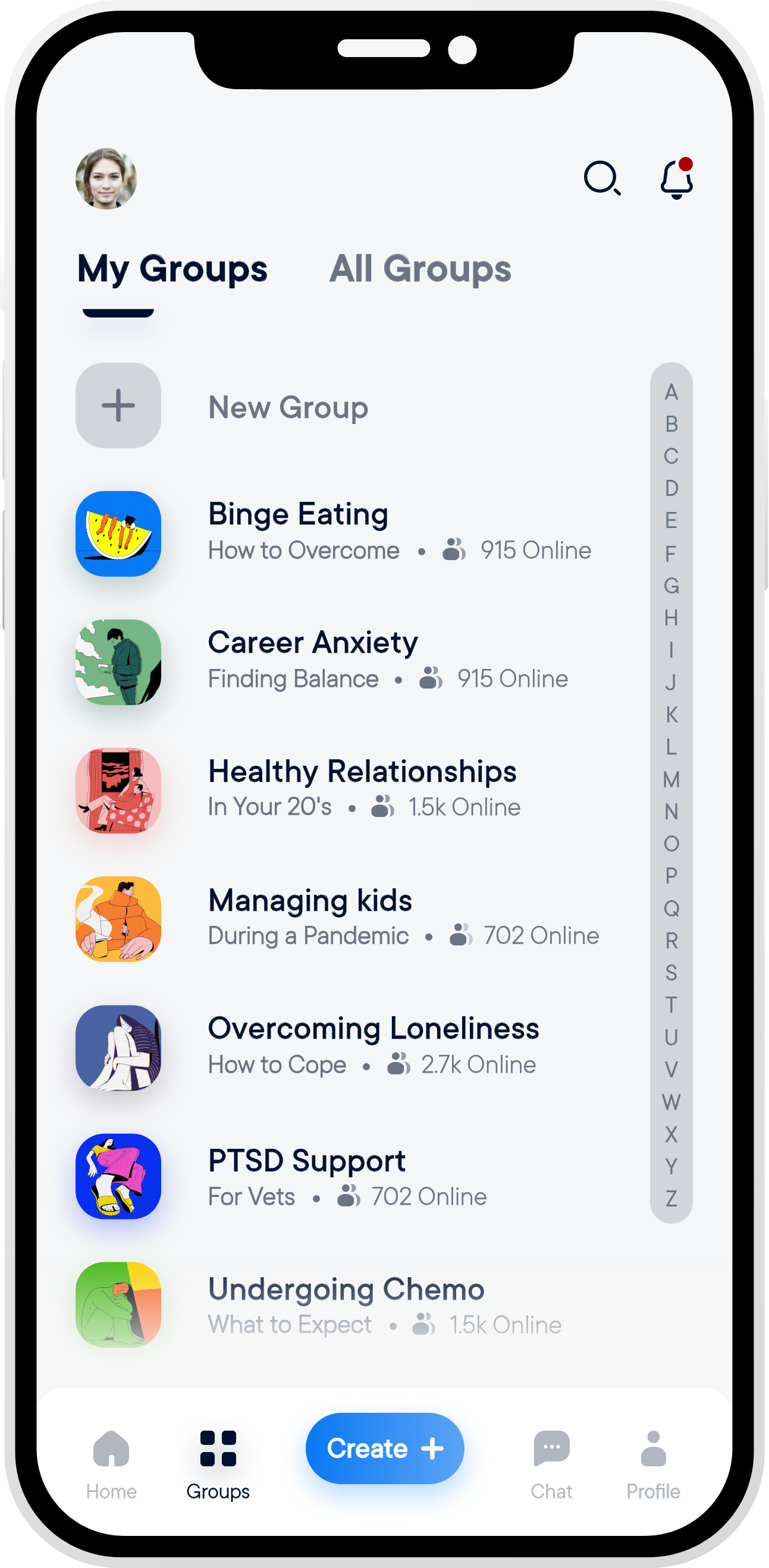
"My Groups" (Groups user belongs to)
Support Group Page
Support Group Page Sessions Feed
Group Therapy Audio Call Session
Audio Call Session - Chat
Post-Session Rating Modal
Flow 2:
Creating / Scheduling a Session
(Video) Create a Session Flow
Create Session "Begin Audio Session"
Select Support Group
Add Session Topic and Description
Schedule Session
Select Date and Time
Select and Invite Peers
Audio Group Therapy Session
Flow 3:
Finding and Joining a Support Group
(Video) Find and Join Support Group Flow
"My Groups" Page Empty State
"All Groups" Category Page
"Anxiety" Category Page
Restricted Support Group Page
Request to Join
Granted Access to Support Group
Support Group Added to "My Groups"
Flow 4:
Requesting a Session via User Profile (Two Scenarios)
(Video) Request Session via Profile Flow
Search for Practitioner
Search Users/Therapists by Keyword
Practitioner Profile
Session Requested
Flow 5:
Request a Session / Chat with a Practitioner (via reccomendations)
(Video) Request a Session and Chat Flow
Search for Practitioner
Recommended Practitioners
Request Session
Chat Page to Message Therapists
Exchanging Messages with Therapist
Flow 6:
Learn more about Support Groups
(Video) Support Group About Section Flow
"My Groups" (Groups user belongs to)
Support Group Page
Support Group Page "About" Section
Step 13:
Validation
The most persistent problems with this project have been the navigation and labeling. Because this project has few precedents, labelling things clearly in a way that matches users’ mental models has been tricky. Some users have consistently been confused by the “Groups” tab (I.E. is “My Groups” a list of all available groups or the groups a user is a member of?), and the word “Session” vs. “Support Groups”.
The navigation has improved tremendously and most users had no trouble completing the assigned tasks. However, the groups page has been a sticking point for some. Some do not see the need for a list of support groups one is a member of (opting to use the search bar instead), while some find it useful.
Next Steps
The success of VENT as a platform relies upon fine tuning the navigation and labeling to make it abundantly clear what each function does. This, in part, can be handled by a robust onboarding sequence but further refining and testing is equally crucial.
Like any online therapy platform, online support groups amplifies an existing issue with privacy. Confidentiality is less certain online, and while the audio-only calls and the potential for pseudonyms help, therapy is largely about feeling safe and confiding in others. This must be taken seriously if VENT is meant to help struggling individuals.